Monday, January 13, 2014

3rd Marking Period

                                                                      21A: 2D Shapes
For this assignment, I used Google SketchUp. I first adjusted the camera to a front view and used the pencil to make a line. I made a square measuring 3' each. I also used the pencil to make a triangle with sides 3' each. I then used the circle tool to make a circle with radius 3'.


*************************************************************************************
                                                                    21B: 3D Shapes
For this assignment I used the shapes from 21A. I set the camera to the side of the shapes. I used the push and pull tool and pull the shapes outwards to make a depth to the shape. I was able to make a 3D object.


*************************************************************************************
                                                                21C: My Name in 3D
I first made a 3D rectangle and cut out pieces of the rectangle with the pencil for my letters. I then used the push and pull tool and pushed in the rectangle to delete the excess shapes. I was able to do this for the M, E, and A. For letters R and J, I used an arc tool to make the curves of the letter. I used the push and pull tool again to take out the excess shapes.

*************************************************************************************
                                                                       22: Blocks

1: 8'x5'x5'

2: 8'x5'x5'

3: 9'x4'x6'

4: 7'x6'x4'

5: 8'x5'x5'

6: 8'x5'x6'

7: 8'x5'x6'

8: 9'x5'x6'

9: 9'x4'x6'

10: 11'x3'x6'

11: 8'x5'x6'

12: 9'x4'x6'


For each of these blocks, I first made a rectangular prism using the noted dimensions. I transferred the measurements of the block onto Google SketchUp. I used the pencil tool, the push and pull tool, and the measurement tool. When I made the rectangular prism, I would use the push and pull tool to make a shape according to the block measurements. From this assignment, I learned how to use these tools and imitate a 3D object onto Google SketchUp using my procedures of my own accord. Rather then following steps from a website, I had to make the blocks on my own while thinking through a 3D aspect.

************************************************************************************
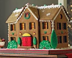
                                                              23: Gingerbread House
For this assignment, I used Google SketchUp to almost imitate a gingerbread house I found in the internet.  I first made a rectangular prism with dimensions 24'x10'x14'. I used the push and pull tool to make a form of the house with a triangular top. I pushed out the triangle and made a form on an attic. I made the windows of the house by making a square and pushing in 2" using the push and pull tool. The red candy bars were made using the pencil tool and i used the push and pull tool. Also, I made the circular window by using a the circle pencil tool and used the same method when I made the rectangular windows. I added the gumdrops, downloading them from Google warehouse and resizing and rotating them aligned with the house. From this assignment, I learned how to make a 3D object from scratch from a given picture. I transferred a 2D model to a 3D model.


************************************************************************************
                                                       24: 3D view of the Gingerbread House
For this assignment, I used Adobe Photoshop to modify the 3D of my gingerbread house. I made my gingerbread house my background and made a foreground too. The foreground will be formed into 3D and the background will be made into 2D. I duplicated the foreground and named the layer 'red'. I but the red layer in front of all the other layers. I went into advanced blending options and customized the setting according to the instruction said in the 3D Art Tutorial. These options was able to make a 3D of the gingerbread house.


************************************************************************************
                                                                25: Glowing Button
For this assignment, I made a glowing power button gif using Adobe Photoshop. I started by making a canvas size of 800x600. I used the ellipse tool to make a circle.  I modified the blending options according to website's instructions (http://www.photoshop-plus.co.uk). I used the free transform tool and made a smaller circle and formed a concentric circle. I cleared the layer styles and made a new layer style using the what the instructions said about the blending options. I then added a aluminum effect using the filter options. I added a power button and modified the blending option to make a still glow. I used the color blue. I copied everything and made a group called 'glow group'. I opened the animation window and converted it to frame animation. There will be two frames where one is not glowing and one is glowing. I selected tween and followed the instructions with the tween settings. Now we have 7 layers and reversed the frames. I selected all 14 frames and right clicked and clicked delay. From this assignment, I learned how to make an animation.
*********************************************************************************
What is a gif?
Graphics Interchange Format. A gif is a compressed image file format where it supports colors and various resolutions. Gifs are used to store digital color images and short animations.


How does animation work?
An animation is when  an object is moved in small intervals linking individually photographed frames. This exhibits an illusion of movement when the sequence of frames is played in a continuous manner. Animation gather a plethora of photographed frames consecutively related to each other. When the frames are moved together through a link it creates motion.
*********************************************************************************
***
                                                                26: Showroom


For this assignment, we used Adobe Photoshop. At first we used the rectangle marquee tool and initiated a fixed size for the rectangle marker. We used the paint bucket and filled it with black. With the first size we made a big rectangle noted in the website, http://www.photoshop-plus.co.uk/2011/09/21/learn-how-to-create-your-very-own-showcase-room/#more-648. We then used the ruler tool and made guide lines. For each of these rectangles make a copy of the layer and delete the layer which only leaves the guidelines. You repeat the process for the smaller rectangles. Following the blending options for each part of the room. At the end you should have a room. Finally for the showcase room we have to make the lights. Use the eclipse tool and make a oval on the ceiling layer. After that use the blending options noted on the site and make a in in depth version of the light. After that make a smaller oval then the oval you previously made and fill it in a white color. So far you made one light. Then put all the light details in a group and copy the group two times and now you should have 3 lights. Use the elliptical tool to make 2 more ovals to initiate the shade of the light. Follow the blur options noted on the site. Also, put them in a group and make a copy. Now you should have the full showcase. In this assignment, I learned more in depth knowledge about blending options and how to manipulate images into images of your liking through blending options and filter modes. 
***********************************************************************************
                                                                      27: Brochure 
For this assignment, we used Microsoft Publisher. I just made text boxes and added my descriptions. Also i added images and made the layout of the brochure in my own way. 

**********************************************************************************
Reflection:
Throughout this semester of Multimedia,  I was able to gather a plethora amount of skills. I learned how to use PowerPoint, Google Sketch-up, Adobe Illustrator, Adobe Photoshop,  and Publisher. I learned how to make images ranging from 3-D in Google Sketch-up to 2-D in adobe illustrator and adobe Photoshop. using online instructions. Also I learned how to make a simple Gifs using animation in Photoshop.


Thursday, November 7, 2013

2nd Marking Period

11: FLYER


In this assignment I used everything I learned for first marking period. For the text, Noche de Ciencias, I created a glass text which I learned from tutorialboard.net. Then I used a gradient overlay to make the background using the diamond option. I went to Google images and used the place option to place the images to my desired location.This assignment helped me realize the different objectives Photoshop can fulfill. For example in this assignment, we made a poster with our knowledge of different text types.
*********************************************************************************
                                                     12: TEXTURE WITH LAYER MODES

In this assignment I learned how to texture with layer models by using clipping masks to constrain the visibility of one layer to that of the layer beneath. The bottom most layer acts as a mask for the layers above it. First I made a new layer from the jacket from the image by using a magnetic lasso. I went to edit then copy merged. I selected the texture file then used the move tool and placed it over the suit. Then I merged the layers together by looking at the crossing circles and changed the opacity.  base layer.
*********************************************************************************
                                                    13: CHANGE ONE THING POSTER

In this assignment, I mimicked a poster made by Food Bank. First I  made a solid color background and downloaded two images on different files.I used the magnetic lasso on the two images and placed it on the background. I went to bending options of my combined images and went to the outer glow option. I adjusted the value to 450 to increase the outer glow of the image. I pasted the food bank image and also used the outer glow option of blending options. For the text I used the impact font. Altogether for this assignment, I learned to explore the function of outer glow and manipulating images to my own liking.
*********************************************************************************
                                           14: HALLOWEEN PROJECT ON PHOTOSHOP

In this assignment, I learned how to create a Halloween creation by using simple tools and  techniques like pen tool, brush tool, and layer styles in Photoshop. First I made a solid color background and used magnetic lasso to extract a pumpkin image. I placed it on the background. I then duplicated the recent layer and used the pen tool and made carvings into the pumpkin. I then used the sketch with the pen tool and modified a light coming out of the pumpkin through blending options. Also, I used the stamp tool and made a shape under the pumpkin to represent light and i used the smudge tool to make it look more realistic.
*********************************************************************************
                                        15A: PAINTED EFFECT LOOK ON A BRICK WALL      


For this assignment, I created a painted effect look by overlaying an image distorted with a displacement map. It places an image over a grid that creates a textured look. I first created a new file and saved a brick wall and a flag image. I opened the 2 images and used the move tool and placed the flag image over the brick wall image. I selected hard light on the brick layer. I selected the brick layer and duplicated the brick layer. With the copied layer and went to filter, to blur, to Gaussian Blur. I saved the displacement map to my desired settings. I then selected the flag layer and went to filter distort and displace. With the displacement map I chose earlier I selected OK and created a new feel to the flag on the brick wall. With the blending options of the new image i chose hard light again and changed the opacity of the image to 80 percent.
*********************************************************************************
                                         15B: PAINTED EFFECT LOOK ON A FACE


For this assignment, I used the same concept related to the brick wall and the flag. In respect to the brick I used a "selfie". I followed all the instructions that were on tutorialboard.net and I used the smudge tool to make the flag actually on my face.
*********************************************************************************
                                                16: SMART FILTERS IN PHOTOSHOP


For this assignment, I learned how to use smart filters. First, I opened the image as a smart object layer and went to blur then motion blur and filled in my desired settings. Now we want only the background to be moving, so I clicked on smart filter and selected the brush tool and started to erase the person. This allowed me to distinguish that the motion blur effect was based on the background not the person.
*********************************************************************************
                                        17: Quick Mask to Make a Detailed Selection


For this assignment, I learned how to use a quick mask to make a detailed selection. In this case I changed the color of Mr. Medina's eyes. First i opened up the image and zoomed into his eyes until I saw pixel images. Because the person in this image does not show the eyes greatly I used the zoom in tool to get the pixel images of his eyes. I clicked on the default colors button to set the foreground to black and white and clicked the quick mask mode button. I clicked on the brush options and painted over the pixels of the eyes. Now you see a shaded red over the eyes. Turn off quick mask mode and click select then inverse. Since I chose green for the eyes, it changed the color of the eyes from brown to green.
*********************************************************************************
                                                         18:  Soft Focus Effect

For this assignment, I learned how to add a soft effect to make a portrait glow. First i found an image online added it to the background. I copied the background layer  and clicked filter and convert for smart filter. Then I went to filter then blur then gaussian blur to fix in my desired settings. I then changed the images from normal to screen. Using the brush, i made a outline on the eyes and the lips so it can show though the glow. Also, I made the opacity 40% to make the glow more noticeable.
**********************************************************************************
                                                                    19: Detailed USB

For this assigment, I used Adobe Illustrator to make the realistic pen drive. I learned how to create a realistic pen drive only using shapes and gradients. First I opened a new document and made a rectangle using the rectangle tool about the size 175px by 350px. I centered the rectangle to the middle of the page and used the ellipse tool about the size 175px by 50px. I used the move tool and placed the ellipse at the bottom of the usb. Using pathfinder, I united them. I filled up the shape using the gradient tool. I followed the instructions tutorialboard.net for the gradient color. From steps 8-17, I made the tip of the usb by making rectangles using the rectangle tool and adding more details to it. Also, in these steps I made the middle of the usb by making a rounded rectangle.
**********************************************************************************
                                                                     20: Wireless Phone


For this assignment, I used Adobe Illustrator to make this stylish phone. I followed the instructions from this website: http://vector.tutsplus.com/tutorials/illustration/how-to-create-a-stylish-wireless-phone/. In this assignment, I used Offset paths and various gradients to create a three dimensional phone with realistic highlights and offsets. Throughout the tutorial, I was making rounded rectangles and changing the gradient styles stated in the tutorial. Also we used the ellipse tool when ever it was applicable. Also I used the font wingdings to create the symbols and used a ditial font to create my name. In this lesson I learned to how to create various offsets and create details that are realistic in relation to the phone.